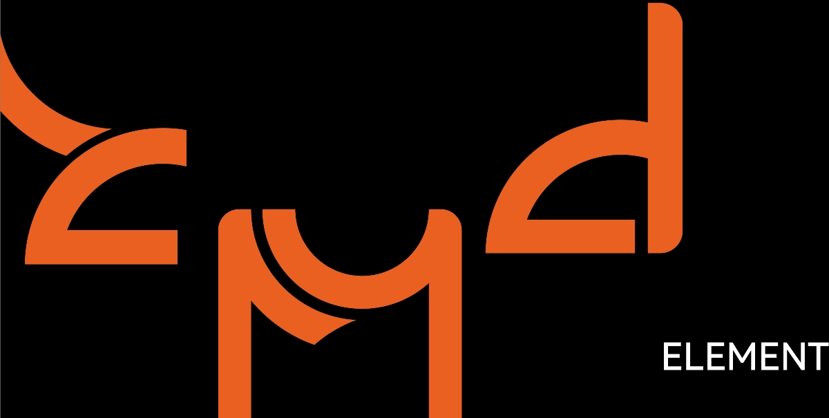

标志的主体采用了圆环切割、堆叠的设计形式,纠缠的层次关系体现了“编织这一概念,同时上半部分的圆弧设计代表了“承托、承载”的概念,与“梦这一次相互吻合,边框的设计主要采用了圆角的方式,这样更能拉近与顾客之间的具体,使图标更具有一定的亲和力,同时我们可以在标志的主体里找到字母“Z M D”,与我们的品牌名称“织梦岛”相得益彰,同时又能让受众从图表中寻找出相对应的品牌元素,增加受众的观看时间,让顾客牢记的印象。

The main body of the sign adopts the design form of ring cutting and stacking, and the entangled hierarchical relationship reflects the concept of "weaving". At the same time, the arc design in the upper part represents the concept of "bearing and bearing", which is consistent with "dream" this time. The frame design mainly adopts the way of fillet, which can better narrow the specific relationship with customers, Make the icon have a certain affinity. At the same time, we can find the letter "ZMD" in the main body of the logo, which complements our brand name "Zhimeng island". At the same time, it can let the audience find the corresponding brand elements from the chart, increase the viewing time of the audience and let the customers remember the impression.

配色方面主要采用了灰色和橙色这两种颜色,橙色代表了活力,年轻,积极进取以及对新鲜事物具有的好奇心,并且拥有着不怕困难,战胜挫折的韵味,同时橙色也给害怕的顾客在颜色上给予一定的鼓励。

